Web Development, Graphic Design, Logo Redesign, Booking System Integration and Photo and Videography.
Sayang Sanur Resorts is a serene haven for travelers in Bali, but its digital identity needed refreshing to convey its true charm. ASA Studio’s mission is to translate this physical experience into a virtual one, where visitors can feel the tranquility of the resort from their screens. Through visual storytelling and intuitive navigation, we’ll make every digital interaction a reflection of Sayang Sanur’s welcoming spirit.

For the brand update, we set out to enrich Sayang Sanur’s visual identity with colors and motifs that resonate with the resort’s serene, coastal charm. Inspired by Sanur’s beachfront, we developed a palette grounded in soft hues like sandy beige, ocean aqua, and lush tropical greens, all designed to evoke a sense of calm, relaxation, and connection to nature.
The redesigned logo incorporates a hexagonal wave shape, symbolizing Sanur’s coastal surroundings, paired with a delicate rope plant motif found around the resort. This not only anchors the brand in the natural environment but also reflects the sense of unity and tranquility Sayang Sanur embodies. By combining these shapes with a soothing aqua tone, we highlight the beachside element integral to the resort experience.
For typography, we selected Abhaya Libre for headers, lending an elegant yet approachable feel, and Poppins for body text, chosen for its modern simplicity and readability. This typography combination creates a sense of sophistication without sacrificing clarity, ensuring that the brand feels cohesive across digital and print platforms.
Through these design choices, we crafted a visual story that feels authentic to Sayang Sanur’s atmosphere, encouraging visitors to imagine themselves immersed in the beauty of Sanur Beach. The cohesive new brand identity is now ready to captivate guests from their first visit to the website, enhancing the resort’s appeal and setting the tone for a memorable experience.
In this video, we wanted to capture the resort’s laid-back vibe and the friendly welcome from the staff. The idea was to show how guests are warmly greeted and taken care of with genuine hospitality, setting a relaxing tone right from the start. Each scene highlights the calm atmosphere and the attention to detail in service, letting viewers feel the peaceful energy of Sayang Sanur before they even book. It’s a sneak peek into the serene getaway that awaits, with beautiful views and a welcoming feel.
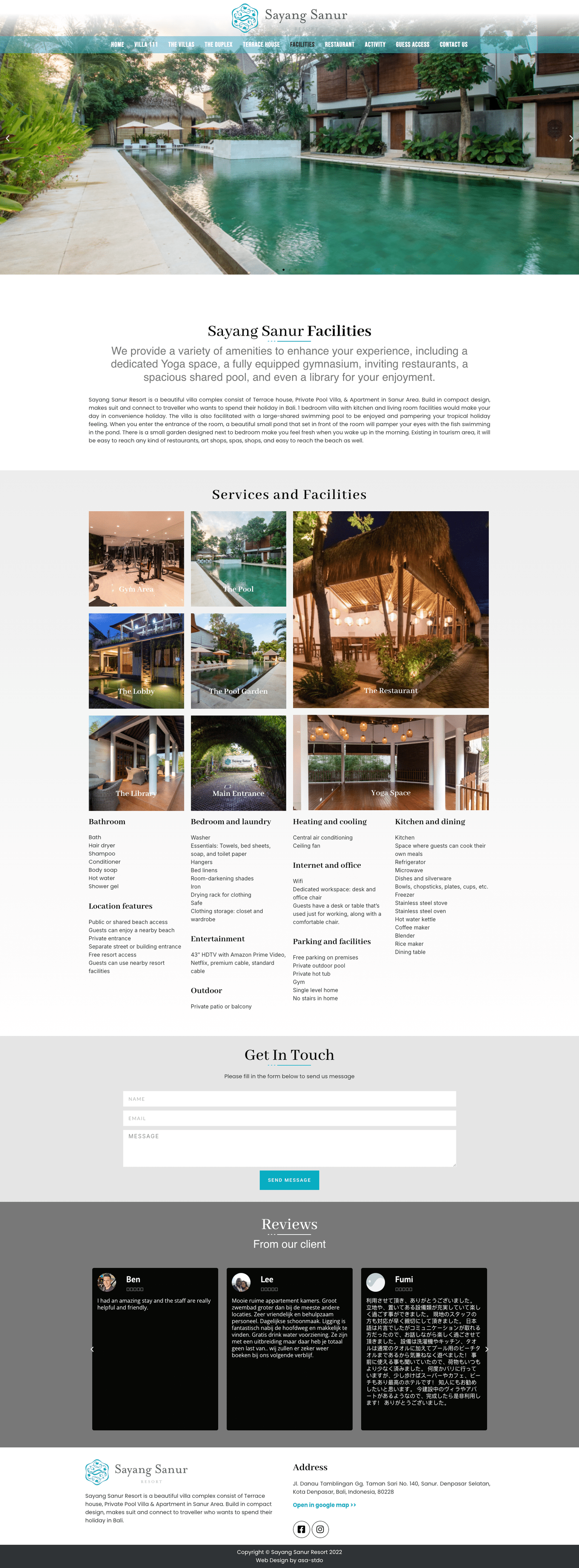
Our redesigned website will be visually clean and easy to navigate, featuring sections for rooms, dining, amenities, and local experiences, each brought to life through vivid photography and video. High-quality visuals will capture the essence of the resort, allowing visitors to explore rooms, facilities, and local scenery. Additionally, the booking system, connected through Book and Link, will offer a smooth booking process, adaptable for both desktop and mobile, allowing guests to plan their stay effortlessly.


The launch will unveil an online experience that captures the warmth and elegance of Sayang Sanur Resorts. The website will not only be a booking platform but also a welcoming introduction to the resort itself. With intuitive navigation, beautiful visuals, and a seamless booking flow, guests can now easily imagine and plan their stay, making the resort’s digital presence as appealing as the destination itself.